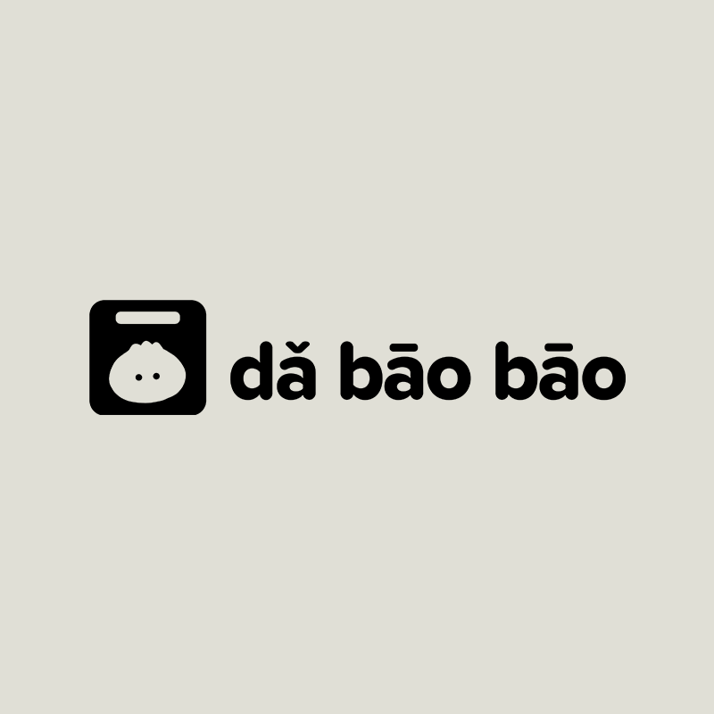


Project Overview
I designed this logo set for dǎ bāo bāo, a food truck business that serves delicious bāo zi and authentic Chinese street food.
I designed the logo to reflect the playful personality of the dǎ bāo bāo brand. I drew inspiration from the soft, round appearance of bāo zi buns and the small plastic bags that are commonly used in China for dǎ bāo (take-out) food in restaurants. The logo illustration also communicates that the food is a convenient to-go food option.
The typeface used in the logo has a soft, rounded appearance to match the style of the bun illustration, and its letters are bold and easy to read from a distance. Overall, the fun and inviting logo is designed to appeal to a diverse target audience that includes foodies, adventurous eaters, and people in the Chinese community who would enjoy the nostalgic flavors of bāo zi, jiānbǐng (savory crepes with egg filling), chuàn'r (skewers of grilled meat and vegetables), cháyè dàn (tea eggs), and fresh xī guā (watermelon). The target audience also includes breakfast and lunch crowds, urban dwellers, people on the go, college students, and young adults.